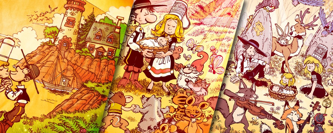
Binbin's Announcement Cards
Benjamin Schweitzer, a.k.a. Binbin, is a friend I met thanks to the Solarus community. He’s one of the original core members, so I know him for a long time. He asked me to draw illustrations for the announcement cards of his wedding, and child births. It’s interesting to see them, because one can observe the evolution/improvement of my style over time.
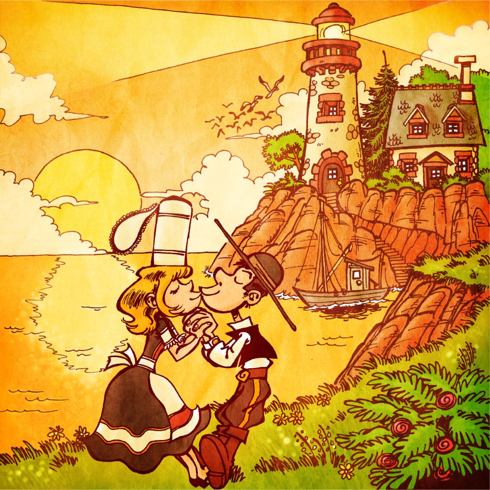
Wedding (2013)
This is the first one I made, so my style was not very refined. It was all drawn with a black pen: I didn’t use quills at that time. I still like the cute scenery, but I think the composition could have been made better: Why do the characters are in the bottom left? Why is there a graphical coincidence between the sea’s horizon and the woman’s hat, that breaks the perspective?
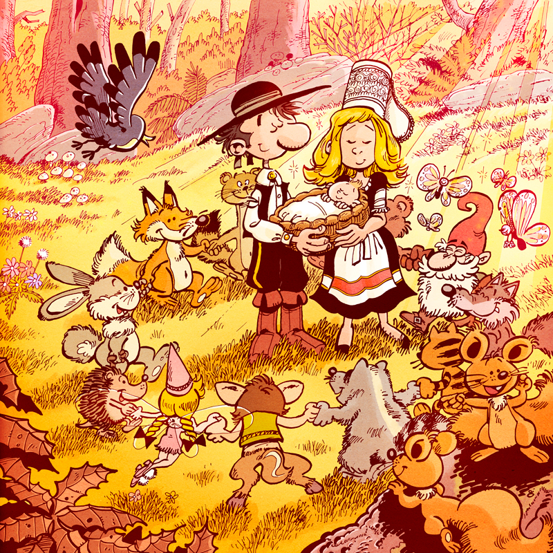
Birth #1 (2016)
This is the second I made, with much more details. I used a quill for the characters, and a thin Rotring for the background. I had to tone down the background line colors to enhance lisibility. Maybe too many details? Huhu. Also, once again there is an issue with the composition: the characters are not centered!
Birth #2 (2018)
The third one was totally drawn with China ink and quill, and is less agressive with effects. I used mor pastel colors, also. You can see my characters becoming less cartoony, athough still in that classic franco-belgian vein. Once again, I find that I didn’t achieve what I wanted to do with the composition, but for my defense, it’s rather hard to make something legible with so many characters. At the foreground, you may have recognized the wolf, the fox and the weasel, from the famous song!
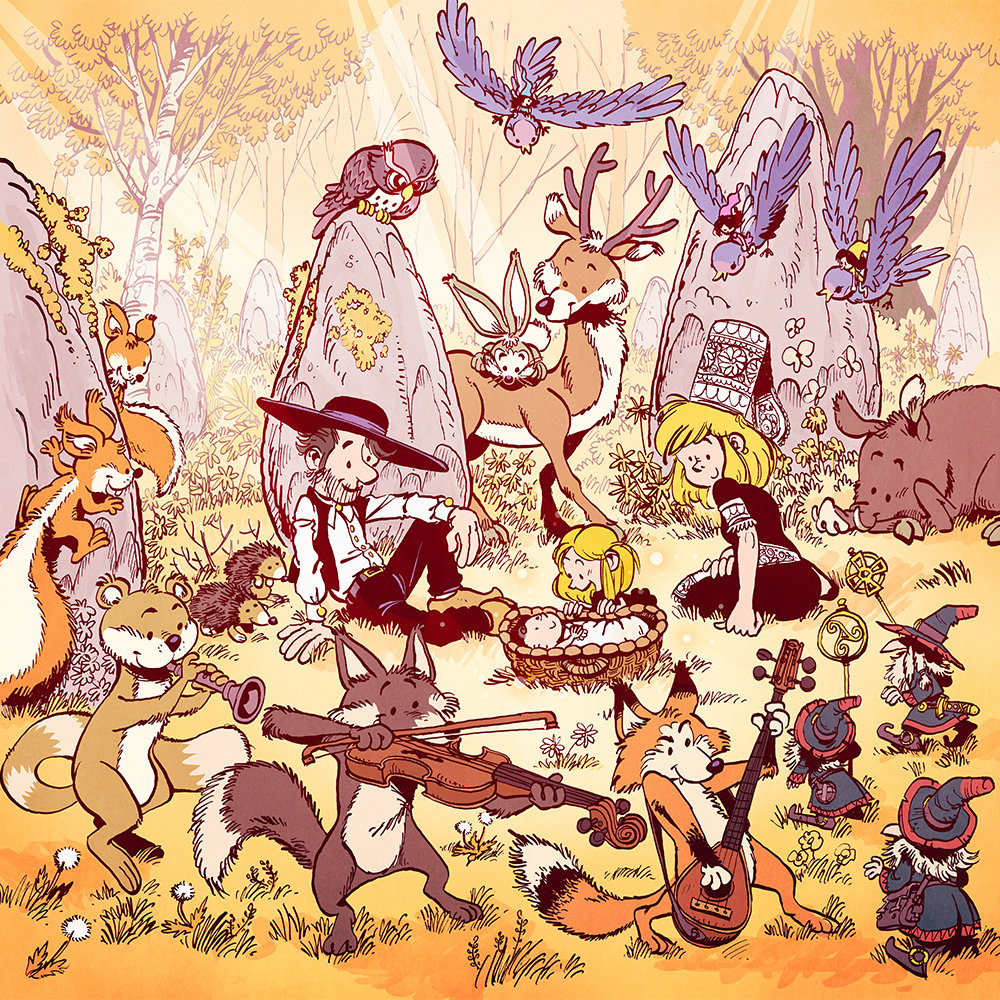
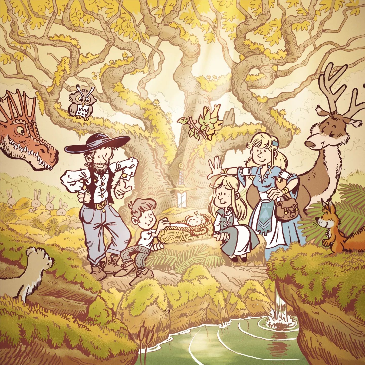
Birth #3 (2023)
The fourth one was drawn with both ink/quill and pen. The quill was used for the characters, and the pen for the rest. The setup, colors, atmosphere and characters were part of the request they made. I tried to made a better composition than before: it’s cleaner, and the eye should not be lost in all the little details.