Miscellaneous Logos (2011-2017)
Designing logotypes has never been my speciality, and I find the process rather difficult, but people often asked me to create some, so I tried, and here are my favourite attempts at this exercise.
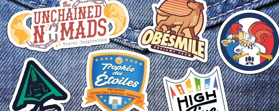
High Five logo (2011)
In France, there were 5 INSA schools at a time. A sports competition between the 5 schools happened every year, and was called High Five. A sixth school was created, but the name was kept. They organized a logo and poster contest in 2011, and I participated. Here is the logo I did.
All the schools have a specific color, so I wanted to highlight that with a rainbow. I also wanted a classic old-school sports team look, with US school typography. My goal was: it should look good on a sports shirt, with brodery.
Brazilian Jiujitsu logo (2012)
During my Computer Science studies, one of my teachers was doing Brazilian Jiu-Jitsu. Since we get along very well, he asked me for drawing a mascot for his team. Someone noticed the patch on his kimono, and asked him who the artist was. It occured that I was the author, and he contacted me to draw another kimono patch for a French team.
It was the first time I tried to do a full-vector drawing, on Illustrator. I scanned some sketches that I drew on paper, and vectorized it line by line. I’m pretty happy with the result: the cock looks fiery and menacing. I guess you can see the Sonic Adventure 1 and 2 style underneath, right?
Aroze logo (2015)
Aroze is a French violonist and electronic music artist from Rennes. He plays traditional celtic music, but modernized with electro beats. He contacted me to create a logo that would reflect this modernity.
Unchained Nomads logo (2017)
Two friends were travelling the World and decided to create a blog to tell their heroic adventures around the Earth. They had a name, the ‘Unchained Nomads’, and wanted a logo. One of them, Mathieu, already had a vague idea of what he wanted: there must be chains and there must be ying-yang.
I tried to make a logo with an adventurous feel, Indiana-Jones-like. The chain link that breaks is the iconic part of the logo, and the rest is built around it. Rusty/dusty colors are perfect to give it a raw aspect.
Obesmile logo (2017)
One of my ex-collgeagues from Arobas Music is also a dog trainer, and has a sports team for dogs. He wanted a logo for caps, T-shirts, etc. After some research, I decided to draw a bold dog that looks to the horizon. The dog’s race is purposely generic, to represent any kind of dog. Once again, I tried to give it an American sports team feel.
Trophée des Étoiles logo (2017)
The Trophée des Étoiles is an international basketball tournament organized by Montgermont, a small town near Rennes, France, since 1988. My family helps the association every time, so I already helped for the organization and made some drawings for it. The logo hadn’t changed for years and was beginning to look dated, so I decided to remake it from scratch.